RECREATE THE SHOPPING EXPERIENCE THROUGH YOUR PRODUCT IMAGES
Storenvy is much more than just shopping. Sure, you can buy cool things. You can also follow styles, watch your favorite stores, and envy and collect the things you love. But we love Storenvy because it gives everyone the chance to build their own online store to share with the world in just a couple of minutes.
Not only can you design your own customized store, but your products also get displayed in the Storenvy marketplace, which drives traffic to your store and boosts your online sales. You’re not limited to physical store locations and real-world retail hours so your store is ‘open’ anywhere in the world, at any time, and you don’t even have to get up off the couch. It’s also great for your customers – they get to avoid waiting in line and those annoying changing room curtains that never close properly…and they don’t have to get up off the couch either.
But let’s face it, nothing compares to being able to physically see, touch, taste, smell, and hear something you want to buy (senses are subject to the item being sold, we’d be very suspicious of a shopper sniffing a pair of jeans or licking a shampoo bottle). So, if you’re running a Storenvy shop, you want to replicate reality as accurately as possible for your visitors, and what better way to do that than with great product images? For a great visual representation, here are four different ways of photographing your product (yes, you should include all four!)
On a white background
You should use a photo on a white background as your ‘hero’ image – the first image that the viewer sees within a series of product photos.
Using a white background makes your product stand out. It draws attention to what you’re selling because it’s free from distraction. Why white? Firstly, colors have different psychological properties that can trigger an emotional response from the viewer, which will have an impact on the perception of the product. Think of color as a form of non-verbal communication; the wrong color can convey the wrong message.
Secondly, white doesn’t clash with any other color. It will suit the Storenvy marketplace design, as well as your own store should you decide to change your theme. You can also use this photo for your other social media platforms, as these websites also have their own themes.
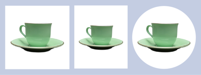
Thirdly, it’s easier to change the dimensions of your photos. Usually a hero image should be square; the Storenvy marketplace uses square frames so if you have a rectangular image, part of your product will get cut off. You can use a square image on your social media sites too – have you noticed that Instagram photos, Facebook album covers and Twitter thumbnail images are all square? And if you do want a different shape, you can just play around with adding extra white space around the original square to create rectangles, circles etc.
From alternative angles
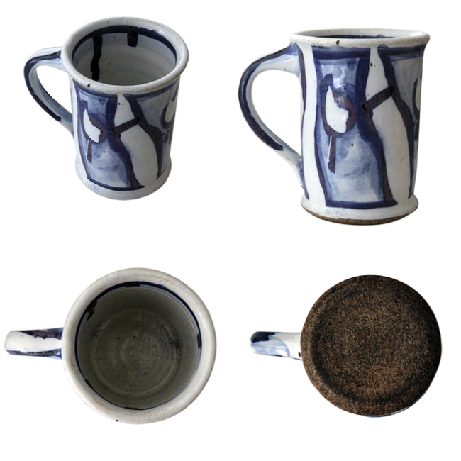
Photograph the product using different angles! This is the closest you can get to a 360° rotational image. Keep in mind that the viewer has to create a 3D mental picture of the object based on a 2D image so show the product from above, from the side, and even from below/underneath. Shoes are a good example of where the customer wants to see the sole, so an underneath shot is required.
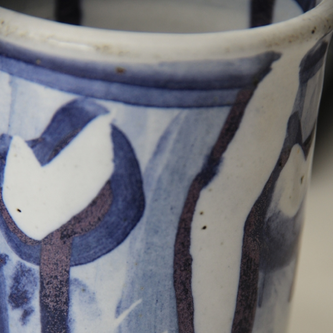
Close-up shots allow your potential customer to see the finer details of the product. This can be really effective if your product offers a visible feature that differentiates it from other products. So if there is something unique to your product design, like the pattern or the texture, show it off! However, make sure you don’t use this as your hero image as the viewer won’t have a clue what the photo is of; it should only be used to complement your primary product image.
In-context
Take a photo of your product in use. If you’re selling a vase, photograph it holding flowers. If you’re selling a dog collar, photograph it on a real dog. If you’re selling shoes, photograph them on feet. You can even do several in-context photos; change the flowers, use multiple dogs, or pair the shoes with different socks.
In-context photos are particularly important if you’re photographing clothes, footwear, and jewelry. The downside with shopping for these things online is that you can’t try them on and see what they look like when worn. Sure, bodies differ from person to person, but you’re more likely to be able to visualize the item on when you see what the item looks like worn on somebody else, as opposed to when it’s presented as a flat lay or using a ghost mannequin.
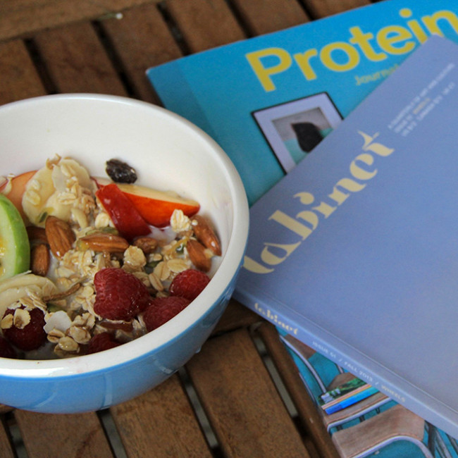
An in-context photo can be effective on a white background, but you can also unleash the ‘inner artiste’ within and take a beautifully arranged photo. Have you ever gone through a look-book and wanted the entire outfit? Or flicked through a furniture catalogue and wanted the entire room? Use people, nature, other products, food, or whatever complements your product, and combine them in an arranged photo to convey a certain quality, tone, or mood that will affect the potential customer’s perception of your product, whether it be simplicity, excitement, warmth etc. Artsy photos can be very effective, but they will look awkward and forced if they’re not done well.
The most important thing to remember is that the background shouldn’t conflict with or distract potential customers from the product you’re selling, so only photograph products that work together naturally – photographing a notebook with a pen is fine, whereas photographing a notebook with a shoe is not.
Also, no matter how amazing the photo is, it shouldn’t be used as your hero image. Remember that you’re selling your product and not showcasing your photography skills. If your hero image is of more than just your product, the viewer may be confused as to which product you’re actually selling.
Pixc helps store owners increase their sales with great product images. We edit and remove the background of a product image and touch it up within 24 hours.

