6 Tips for Writing Product Descriptions

Tip #1 – Use descriptive language.
Instead of listing boring basics like product details (size, color, etc.) from the start, I often use more colorful language to make product descriptions entertaining and engaging. For example, for my Baby Feet Necklace, I start by saying, “Babies leave foot prints on your heart,” since the charm is heart shaped with footprints. Avoid ambiguity as well. Here’s an example of how you can transform a trinket box description in just a few easy steps:
Original sentence: This trinket box can be filled with lots of stuff.
New sentence: This delightful trinket box can be filled with all of your favorite bracelets, rings, cuff links, and other treasures!
Easy fixes like those outlined above really enhance your product description, and with minimal effort on your part.
Tip #2 – Remember: Details are your friend.
You’ve probably heard this before, but a major drawback of shopping online is that the shopper can’t look, feel, smell and so on before they buy. While this is true, a good description can fill in the blanks. How so? Provide real-world examples and comparisons for things like size, color, shape, and any other elements. Always provide accurate measurements of things like main compartments, small pockets, and so on. If it’s a painting, what are the dimensions? What materials is it made with (especially important for potential allergies)? What does the candle smell like? What are the clothing measurements? In person, someone can try on a bracelet, sniff a candle, or hold a dress up to their body. Online, you need to experience this for them and relay the information accordingly.
Tip #3- Break it up!
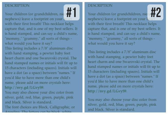
You may need to write a long description for one of your items, and that’s fine – just don’t write a novel! Some of my products have many customizing options, so it’s a lot to write out. But what you don’t want to do is lump it all together, or write them all in one sentence. The brain needs to break writing up so it can process it piece by piece – which is one of the reasons for punctuation and paragraphs. To illustrate my point, read both of the paragraphs below and tell me which one’s easier to read:

Picture number 2, right? That’s because it’s split up. The first paragraph introduces the item, and describes it in a nice light. After that is where I get technical (reel them in first!). The second paragraph has the recipe of the piece – what it is made of. The third has the main customizing options. I broke the paragraphs up into subjects that go together, that make sense. And, each option has its own sentence, or more. I didn’t say “the stamped disc can be colored a, b, c, or d, and the font can be l, m, n, or o, and the lettering color can be x, y, or z.” By the time the shopper gets to the end of the sentence, they can’t remember what the beginning is. Break it up so they can process it, and know what choices they have.
Tip #4- Use website features and variations.
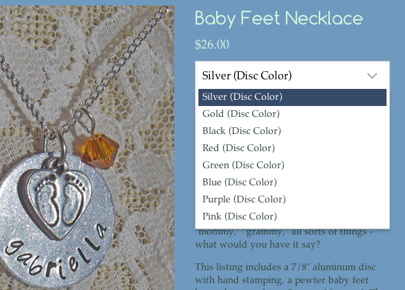
Storenvy is wonderful enough to provide customizing if you can code, but for the rest of us, we can use the variations. And now, with the Cooper theme, there can be a drop down menu instead of taking up visual real estate above the description. I like to give millions of choices (probably too many), so this made me very, very happy to see, as many of my listings have quite the handful of variations! But, you need to use them well. If there’s one choice that you really need to know, put that in the variation (size, color, etc.). If they’re all about the same importance, is there one you’d like to highlight? For my item pictured, you can choose the aluminum disc color, the font, and the text color. None of them are more important than another, in my opinion, so I chose to make the disc color the variation. I don’t get to use colored discs often because people forget I have them, so I want it to be the first option they come to, and one they have to pick.

Tip #5- Ask specifically for what info you need.
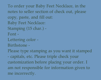
People are simple. Most need directions. And when they’re shopping, they’re most likely not interested in “researching,” to find what information you need for any customizing that may be available. Spell it out for them! The picture below shows what I try to include in every description of a customized product. Whatever choices that are not listed in the variations are asked for here. Whether they actually copy and paste it is another story (though some do), but it helps customers give me the info I need. I also include a disclaimer, that it is their responsibility for giving me the correct information. Some shoppers think you’re supposed to be a mind-reader, so this gives you something to lean on if they mess up (always good to have a backup plan).
Tip #6- Mind your spelling and grammar!
You may grimace when I say it, but it’s true. I’d say 80-90% of shoppers will not take your business seriously if product descriptions are full of spelling and grammatical errors. Everyone makes mistakes here and there, but multiple in one description just won’t work. If you have trouble with it, type your descriptions in Word (or similar) and then copy and paste. It’s worth the extra trouble and extra time to read over it again, I promise. If shoppers can clearly understand what your product is, they will have more confidence in the product, and you as a shop owner. Also, be sure to use proper capitalization. Capitalize the beginning of your sentences and proper nouns. All caps isn’t completely out, but use sparingly, and only on something that is highly important for shoppers to notice. Correct capitalization, spelling, and grammar help make you look professional. And that’s what you want, isn’t it?
 Kristen Start is the owner of kreative studios, a handmade business with everything ranging from jewelry & key chains to hats & bags. You can find the most of her business on Facebook. Aside from crafting, Kristen enjoys writing (fiction novels, mainly), and has a Creative Writing degree.


